

During Apple’s WWDC keynote in early June 2021, one thing that stood out from all the other announcements, for me, was the new UI design for Safari. Safari is central to the experience across Apple devices and this redesign spans all platforms with one design format for macOS and iPadOS, and another for smaller iOS devices.
Safari design on macOS Monterey and iPad OS 15
The new look was first shown during the macOS Monterey presentation where Craig Federighi revealed that tabs will now appear inline with the address bar to maximise space efficiency. This slightly filled me with dread at first, as it instantly reminded me of Internet Explorer 10, where tabs also featured next to the address bar – I was never a great fan.
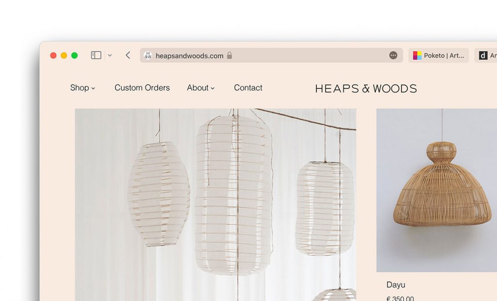
But, the main difference here is that the active tab itself forms the address bar, which is a neat way to minimise the space used, yet also makes logical sense. Overall, it keeps the chrome area at the top of the browser slim and free from clutter.
By taking on the background colour of the page, the tabs have a floating appearance and feel more integrated with the page. This reduces the visual separation of the browser interface and the page content, making the page feel more app-like. To achieve this on your site, the theme-colour meta tag, is required, which you may already be using to colourise tabs on Android devices.
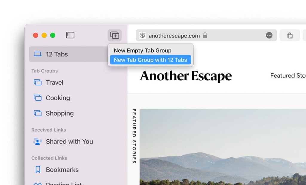
In addition, there are a few other design changes that keep the interface simple. Reader view and sharing options are now accessible from the ‘More menu’, an ellipsis menu inside the address bar. Bookmarks and Reading List remain in the sidebar, along with a new Tab Group feature that lets you sort tabs into collections. Links received in the Messages app will also appear in the sidebar, too.
Why Tab Groups matter with this design
While Tab Groups are already possible by browser extensions, it’s good to see this is as a built-in feature. But why now?
Having the address bar and tabs together in a row limits the amount of space available for more tabs. Safari will remove the page title text from tabs as more get added leaving just the favourites icons, but having lots of tabs open – in a tighter space than ever – will make it more difficult to quickly find the tab you need. Launching tab groups now makes sense to help keep the UI clutter-free. Let’s just hope we don’t get lost in Tab Groups trying to find the pages we need.
Safari redesign on iOS 15
On iOS 15, the design for Safari takes on a different format, but with the same goal; to maximise the screen real estate of the web page and take the UI out of the equation.
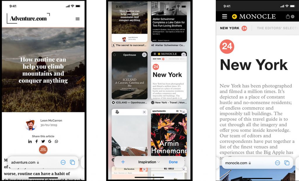
The biggest difference here is that the address bar now appears at the bottom of the screen, within easy reach of your thumbs. Working in a similar way to the Home Bar on Face ID devices, you can swipe left or right on the address bar to jump between tabs, or swipe upwards to view tabs in a grid view.
Scrolling down the web page will also minimise the address bar to the very base of the page, as it does at the moment on at the top of the screen.
The position of the address bar is likely to be the biggest change people will notice, and it’ll take some getting used to. There’s also an increasing trend to place website navigation bars at the base of the page on mobile devices. This could be an annoying issue if the address bar is covering up key page navigation or buttons to dismiss cookie popups.
Overall I think the changes are positive, and a lot of Apple users will welcome the changes. The iOS 15 iteration of Safari is likely to ruffle the most feathers, so it will be interesting to see how well the bottom-orientated address bar works in reality. Public Beta versions of the software will be available from July 2021.